Made by X™ Solutions

Brand Guidelines · v1.0

Under Web

A visual identity built around a single image — a spider, motionless in its web — translated into a flexible system of marks, color, and type for the platform.

The Concept

01 — Foundation

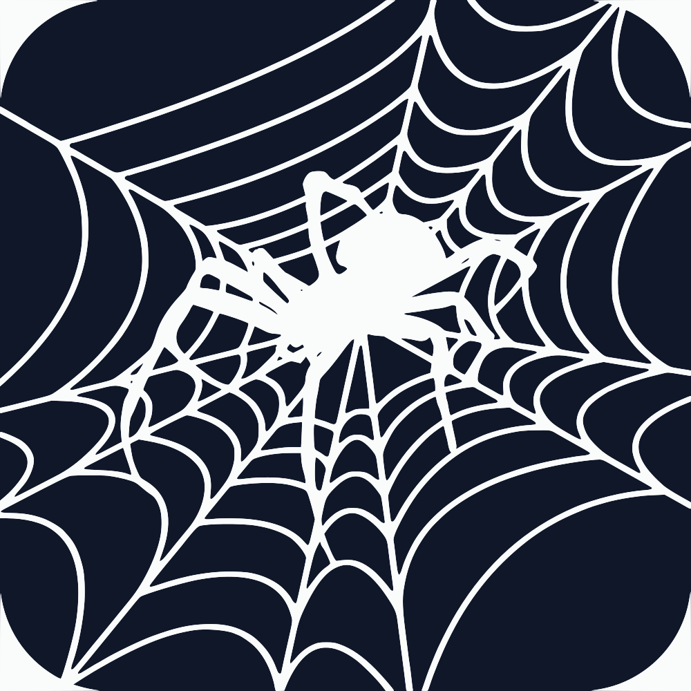
The name splits naturally into "Under" and "Web" — and that split is the whole idea. The mark takes it literally: a spider, suspended in its own web, rendered in a single flat silhouette. It's quiet, a little unsettling, and immediately legible at any size — from a favicon to a banner.

The web itself doubles as a visual metaphor for the platform: a network of connected lines radiating from a single point. Combined with the dark, confined palette, it creates the feeling of looking into an underground space — something hidden just under the surface.

Two color directions were explored for the primary mark — a light silhouette on a dark ground, and the inverse. Both are documented below, with the dark-ground version selected as primary based on how it performs at small sizes.

Color Palette

02 — Foundation

A two-color system, kept deliberately minimal. Every other color used across the platform should be a tint, shade, or transparency of these two values — no additional hues.

Web Ink

#0F172A  ·  RGB 15, 23, 42

Web White

#FFFFFF  ·  RGB 255, 255, 255

Primary Mark

03 — Logo Suite

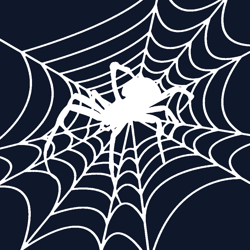
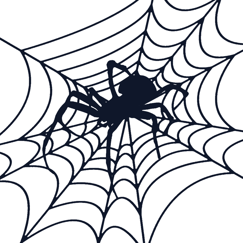
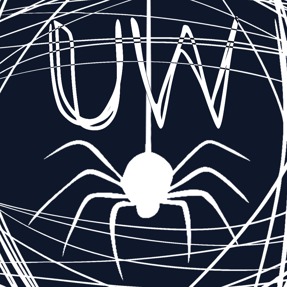
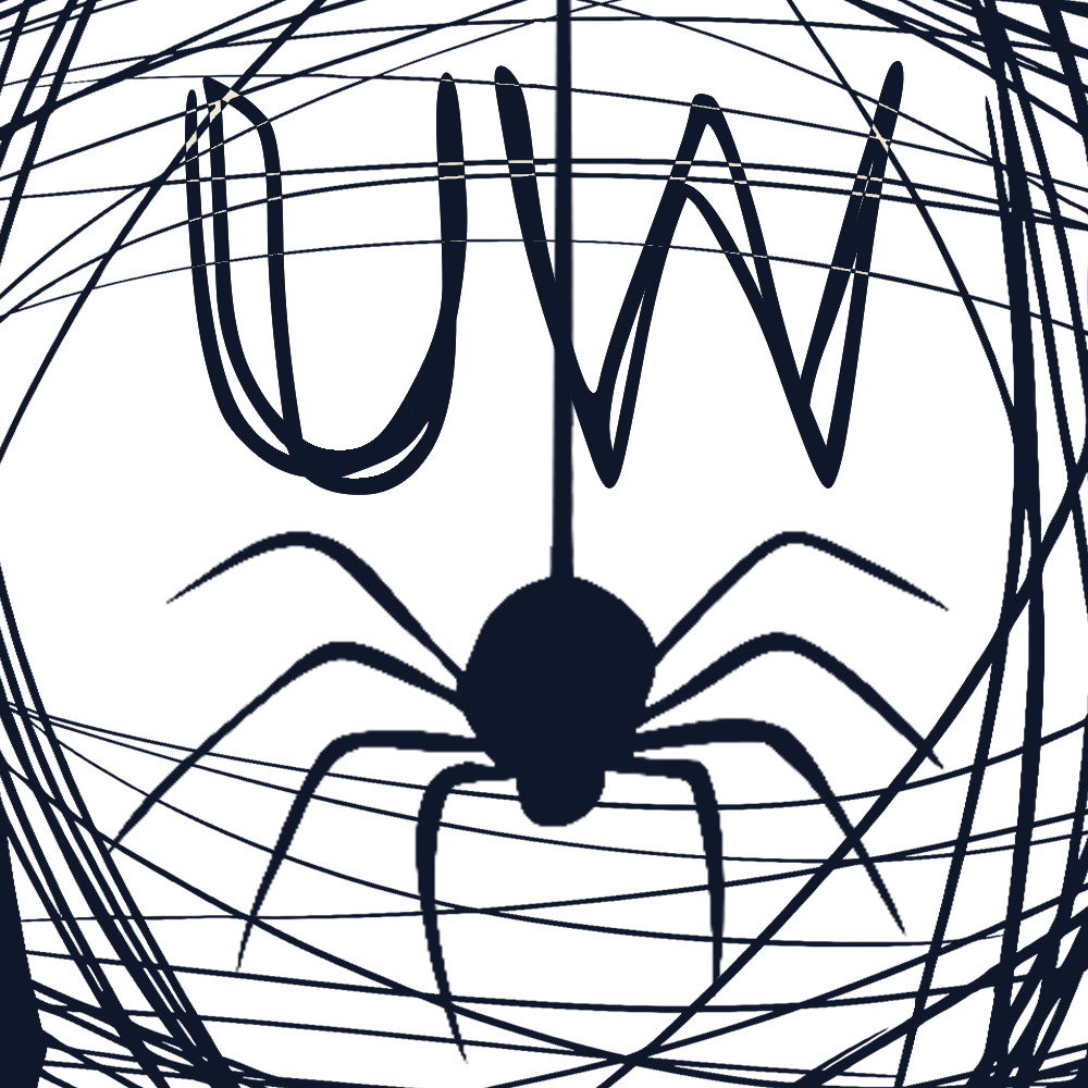
The dark-ground version is the primary mark, selected after testing both options at favicon and avatar scale. The light-ground inverse is approved as a secondary option for use on white backgrounds.

final.svg — White spider on dark-blue ground

Primary — Dark Ground

final.svg · White (#FFFFFF) mark on Web Ink (#0F172A). Use as the default logo across the platform.

Download
final2.svg — Dark-blue spider on white ground

Secondary — Light Ground

final2.svg · Web Ink (#0F172A) mark on Web White (#FFFFFF). Use only where a dark mark on light background is required.

Download

Exploration

04 — Process

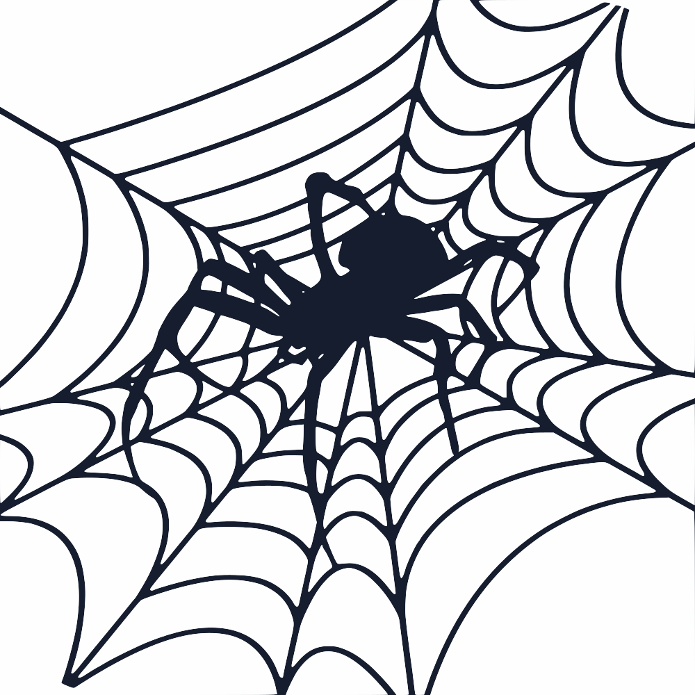
Seven directions were tested before settling on the final mark. Each variation explored a different web density, spider posture, or composition — kept for reference, not for active use.

Exploration 1.1

Exploration 1.1

Download
Exploration 1.2

Exploration 1.2

Download
Exploration 1.2

Exploration 1.2

Download
Exploration 2.2

Exploration 2.2

Download
Exploration 3.1

Exploration 3.1

Download
Exploration 3.2

Exploration 3.2

Download
Exploration 3.3

Exploration 3.3

Download
Final approved mark — miniature test

Final — Approved ★

Option #1 confirmed at avatar scale. This proportion is the baseline for the final mark.

Download

Typography

05 — Foundation

A two-tier type system: a characterful display face for the wordmark and headlines, paired with a clean grotesque for everything that needs to be read at length.

Primary — Display / Wordmark

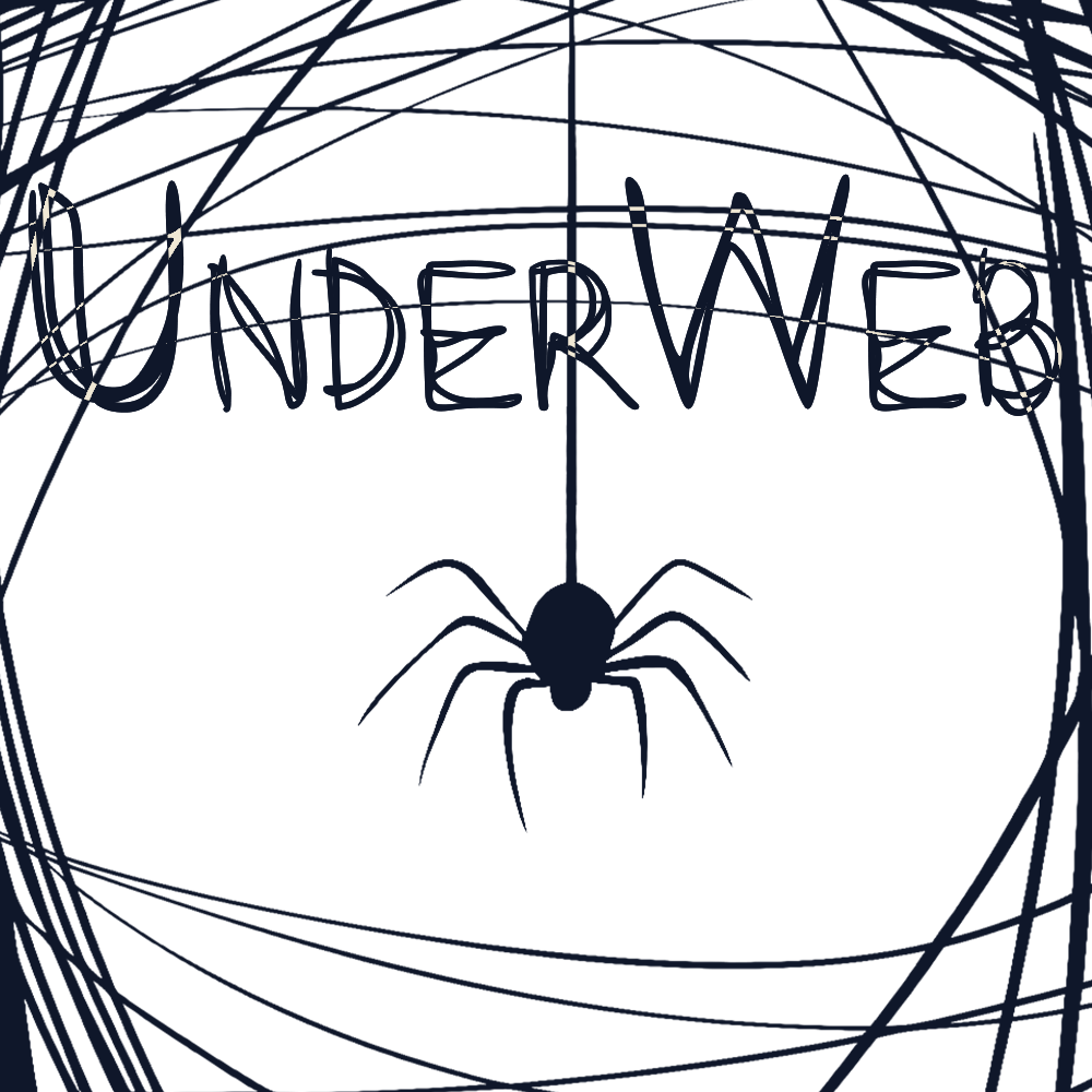
UnderWeb

MakingMovesVer3-nR9B4

Use for: logotype, page titles, large headlines, and banner copy. Always set in sentence case or as written in the wordmark — avoid all-caps treatments, which flatten its character.

Secondary — Body / UI

Aa Bb Cc — 0123456789

Vista Sans OTCE

Use for: body copy, navigation, buttons, captions, and all UI text. This is the workhorse face — legible at small sizes and across the full weight range.

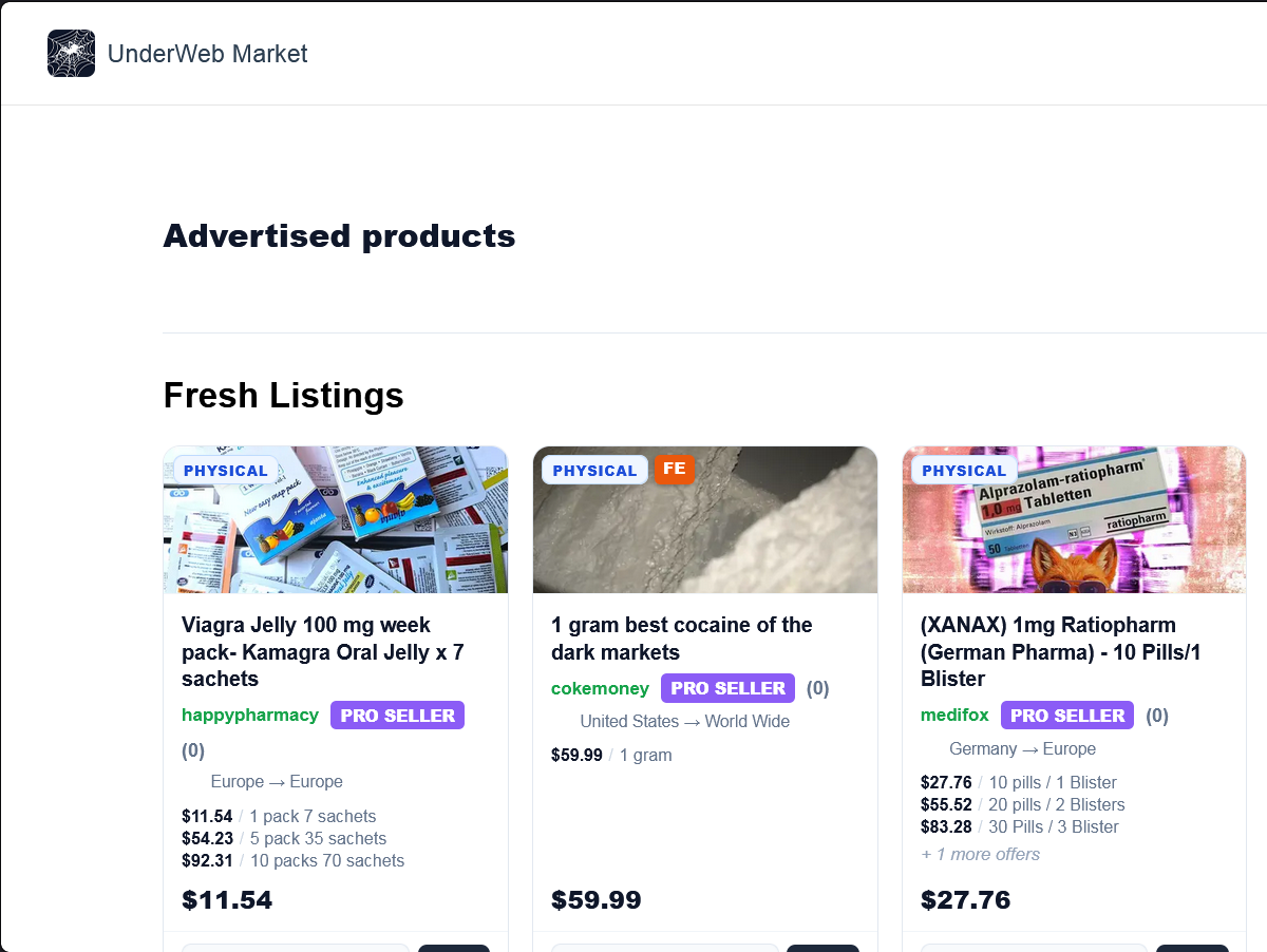
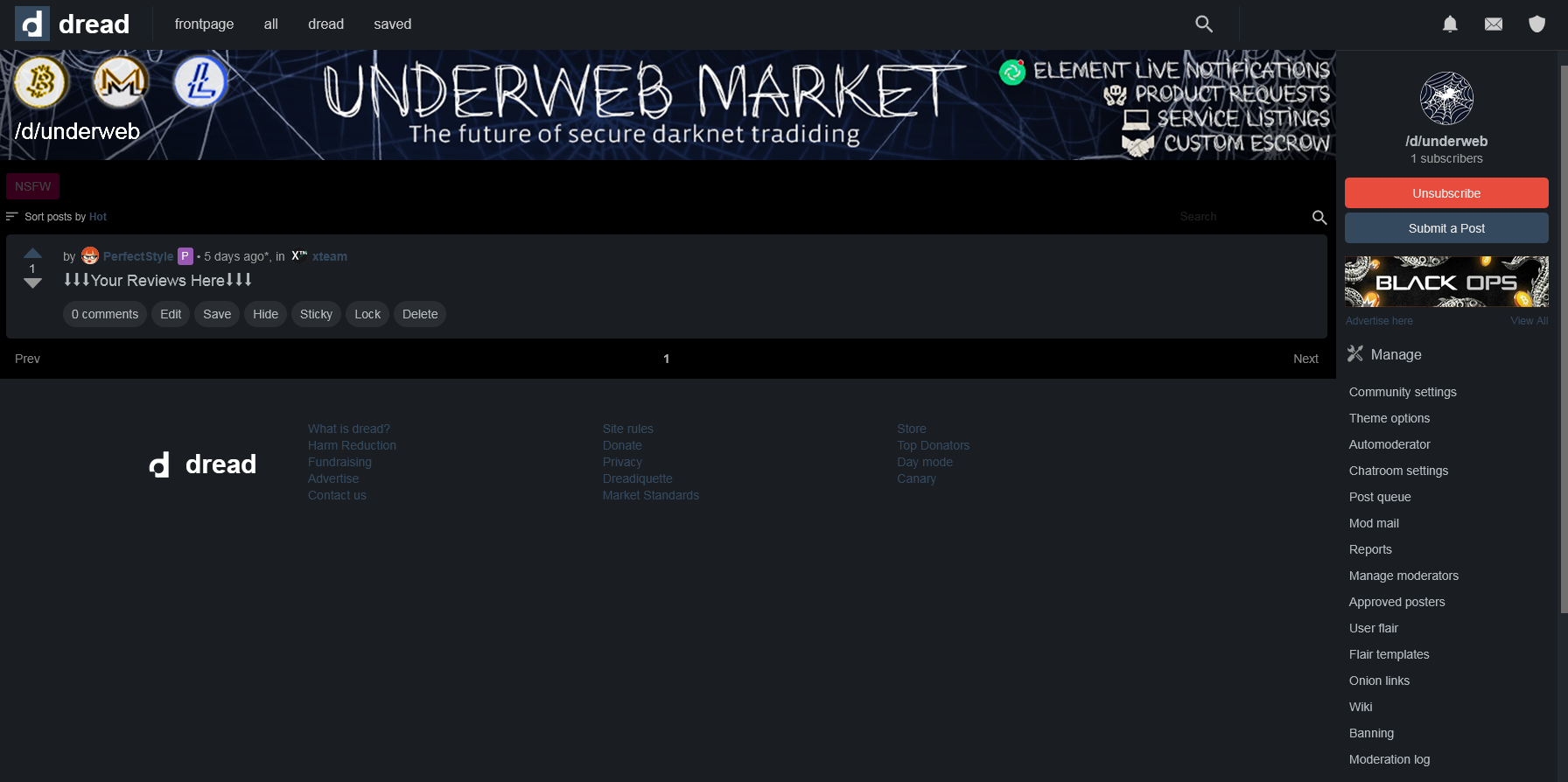
Applied — Dread Banners

06 — Applications

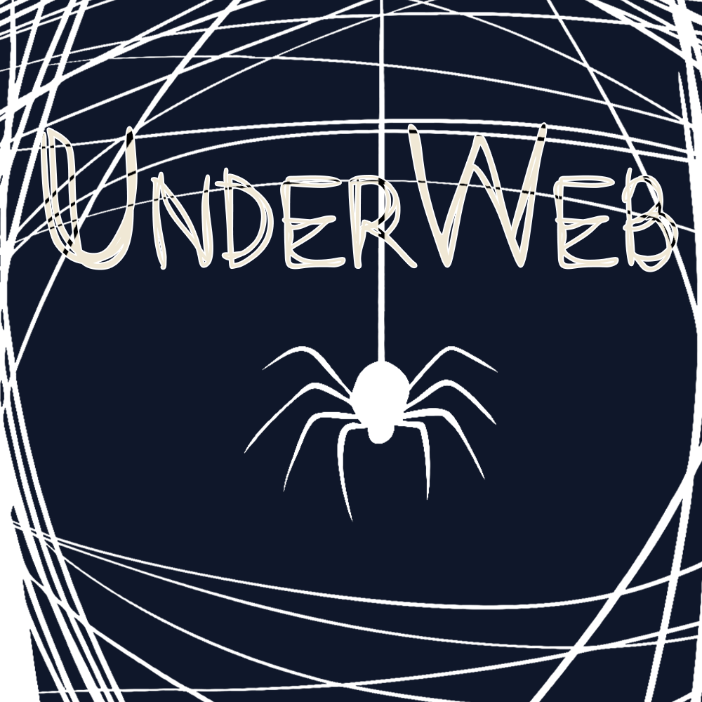
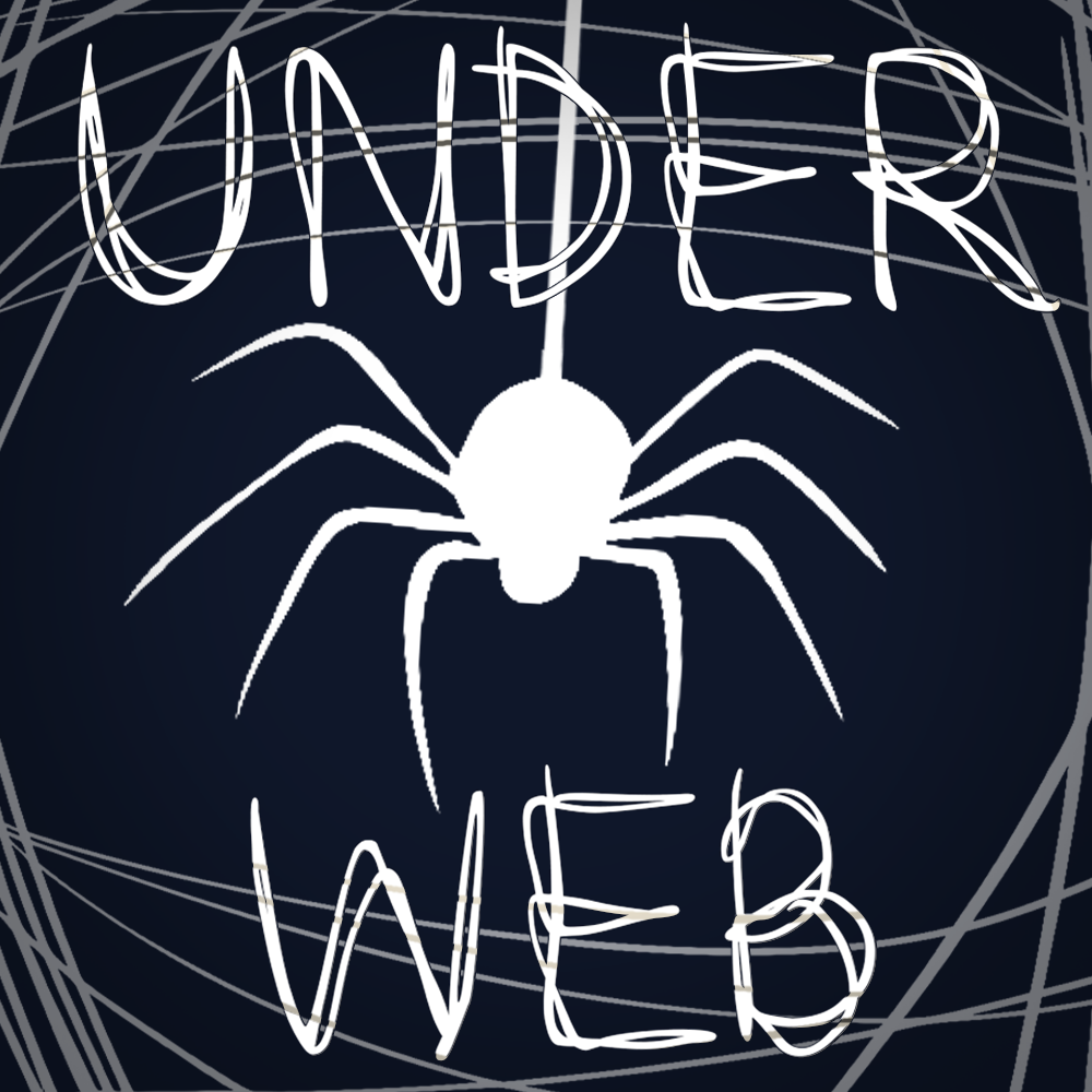
The identity applied to community banner formats. The full-size composition establishes the layout; resized variants adapt the same composition to each platform's crop requirements.

Dread Banner — Concept

Dread Banner — Concept

Download
Dread Banner — Final

Dread Banner — Final

Download

Resized Variants

Banner — Size 1

Banner — Size 1

Download
Banner — Size 2

Banner — Size 2

Download
Banner — Size 3

Banner — Size 3

Download
Banner — Size 4

Banner — Size 4

Download

Usage — Do's & Don'ts

07 — Guidelines

The mark is simple, which means small missteps are highly visible. These guidelines keep the spider-and-web identity sharp across every surface it appears on.

Do

  • Use the dark-ground mark (final.svg) as the default everywhere — favicons, avatars, app icons, and dark UI.
  • Reserve the light-ground mark (final2.svg) for light backgrounds where a dark mark is required for contrast.
  • Maintain clear space around the mark equal to at least the width of one spider leg-span.
  • Keep the web's line weight consistent when scaling — thicken slightly at very small sizes (favicon, 16–32px) so it doesn't disappear.
  • Set the wordmark in MakingMovesVer3-nR9B4 and all UI/body text in Vista Sans OTCE.
  • Keep backgrounds restricted to #0F172A or #FFFFFF (or tints/transparencies of these two).
  • Center the spider as the visual anchor when the mark is cropped or placed off-grid in banners.

Don't

  • Don't recolor the spider or web — it must always be pure #FFFFFF on #0F172A, or the inverse. No gradients, no tints.
  • Don't place the mark over busy photography or imagery that competes with the web's linework.
  • Don't stretch or distort the mark to fit a frame — crop the canvas instead, never the silhouette's proportions.
  • Don't add drop shadows, glows, outlines, or bevels to the mark.
  • Don't substitute MakingMovesVer3-nR9B4 with a system font for the wordmark, even as a fallback in finished assets.
  • Don't combine the dark-ground and light-ground marks in the same composition.
  • Don't rotate or mirror the spider — its posture (legs down, body centered) is part of the mark.

Source Files

08 — Reference
Sources folder — banner background layers and other raw image sources used to assemble the assets above are stored separately in the "sources" folder. Replace the links below with direct download URLs once assets are hosted.

Sources — Banner Backgrounds

Layered source files used to compose the Dread banner and its resized variants.

Download Sources (.zip)

Sources — Logo Suite

Editable vector files (final.svg / final2.svg) plus all exploration assets.

Download Sources (.zip)

X™ logo